
In the reading -Things Make Us Smart (chapter 3 The power of representations), the author Donald A Norman indicated several very impressive examples to explain how information representations become a useful tool as an artificially constructed artifact. By using the the example of the draft of PhD dissertation explains how information representations help people gain a better understanding of an abstract concept. Information representations can also provide and simplify relationships (from the example of two games) or useful data in complex systems (from the example of the comparison of flight duration times between three air companies). On the other side, information representations can help people organize information in a more effective and lucid way (the example of medical descriptions).
In my reading response, I want to use my own experience to support the reading’s points about the usefulness and effectiveness of information representations and add my own understanding and perspective about information representation.
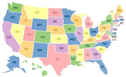
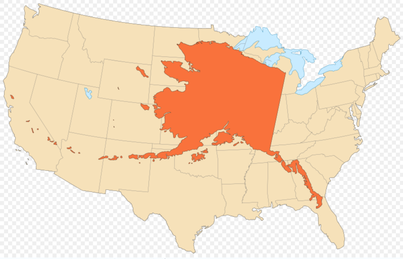
Firstly, I think information representation can also change people’s perspective to observe things and even mislead by providing inaccurate information. For example, when I ask people which is the largest state in Unites States, a lot people think it is California or Texas, and only few people think it is Alaska. This is because the map of USA that we see most commonly (the frist map at below) intentionally makes a different scale for Alaska much more smaller proportion compare the mainland due to the limited space to show the whole nation in the map. But the if we want to make people to have sense of how big the Alaska is, we can show them the map right below with the actual proportion of Alaska with US mainland when they are overlapped (the second map at below). In conclusion, information representation can help people in various ways to obtain information and also represent the principal purpose to the viewer from the information provider.
Secondly, in pages 5-6, the author shows how graphical charts monitor the flight’s duration time between different air companies and how that can help people directly figure out the flight duration time without complicated arithmetic. In this case, I agree with the points of author, but I think he can chose a better example to prove this case. The author shouldn’t use air flight duration time because it is not the most essential information for international travelers. These travelers care more about the arrival time and the condition of air company service. Even in the graphical chart, we still can see the difference of duration time is relatively small.
I would use the comparison of the commute times between different subway lines of the NYC MTA system as an example. People usually associate the commute time with geographic distance between two places and these distances are shown in MTA map quite clearly; But NYC subway offers both local and express trains, and so the distance maybe not reflect the length of your commute time. For example, I live in Washington Heights, Manhattan, and it only takes me 20 minutes to cross over 150 blocks to get to lower Manhattan by taking the A express train, but if I take local C train, the commute time can be over one hour with same distance. If we use visual information representation to show the the length of commute time which is daily commuters and tourist care about the most will prove the authors point that information representation can help us get useful data in complex systems.
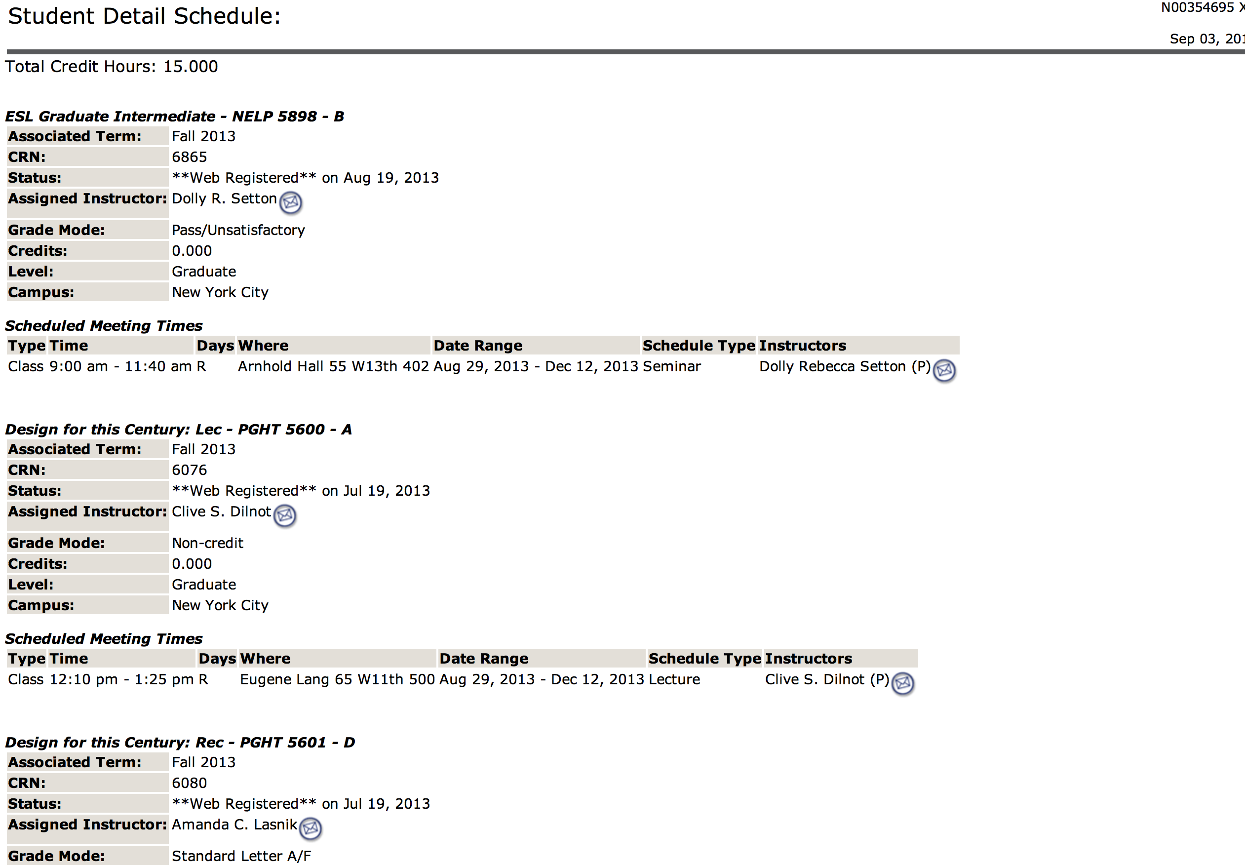
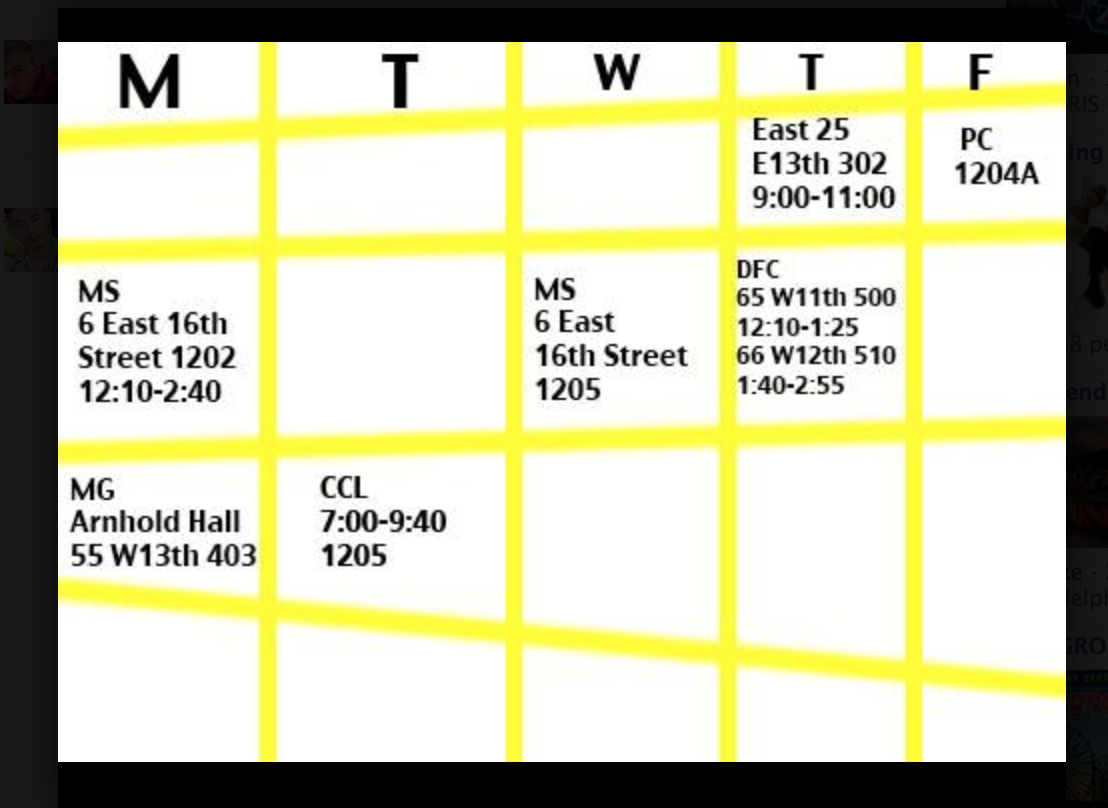
At the end, I found another example to prove the author’s point about how help people to organize information in a more effective and clear way. My class schedule in my NewSchool account contains all the information about the class I have this semester, but the sample vertical layout to present the informations that contain different locations and times during a whole week can be very overwhelming to check everyday.
Organizing all the information in a standard format by time can help me dramatically understand and develop a sense of my class schedule during one week. I can clearly see I have three classes in the noon and so I will have a better idea when I should prepare for my next class.
Comments